
Project Overview
Problem Statement
Literati Bookstore is an indie bookstore in Ann Arbor, Michigan. Before the COVID-19 pandemic, Literati’s website played a small role in the overall business and mostly served as a means of informing customers of events and providing book recommendations. However, when the doors of Literati closed at the beginning of the pandemic, customers went to the website to purchase their books and attend events virtually. It became apparent that the Literati Bookstore website had issues negatively impacting the user experience of the website, and did not compare to the in-person experience customers could get.
Ultimately, the goal of this redesign was to create an online user experience that communicates the one-of-a-kind in-person experience that the Literati Bookstore offers while improving website pages and processes that cause users the feelings of frustration and overwhelmingness, such as the checkout process and navigating through the website in general. With this redesign, I aimed to capture the unique elements of Literati’s physical space into its digital while maintaining information and features users regularly interact with and improving the process of purchasing a book online, through the guidance of UX design principles.
Ann Arbor local bookstore needs to improve their online experience.
Research Phase
Literati Bookstore’s primary target audience consists of retirees and young professionals that seek the unique and personal experience a local, independent bookshop like Literati provides. As stated by the client, the primary complaint about the website is that it doesn’t reflect the memorable and captivating environment that customers obtain by visiting the store in person. Since its original development in 2013, the website has expanded in inefficient ways that disrupt the structure and flow of the website resulting in a difficult-to-navigate site which evokes a negative user experience for users engaging in processes like purchasing a book online, especially on mobile devices.
In addition, usability issues arise in the checkout process, specifically with the number of input fields users are shown, and within the process of browsing for books based on their subject. Throughout the website, users are presented with vast amounts of content that may not all be relevant to the decision of whether or not to purchase a specific book, which can result in users feeling overwhelmed and frustrated. Overall, the site’s current look and feel roughly portray the “hand-made” and “imperfect but thoughtful” aesthetic that makes Literati different from other indie bookstores, and is lost as users navigate further into the site. When users visit the website, they should feel enticed to visit the Literati Bookstore in person.
To guide my research and designs processes, I began with the following questions:
-
What is hindering the current online checkout experience?
-
How can I create a similarly pleasing experience online, as it exists in person?
-
What elements make Literati unique?
Competitive Analysis Findings
To learn more online book shopping experience, I conducted a competitive analysis of the following platforms that could be considered competitors to Literati. The owner mentioned that large corporations that sell books, such as Amazon and Barnes and Noble, are not direct competitors as they lack the small business and indie feel that attracts consumers to these platforms. That said, I evaluated Powell, ThirdtBooks, BetterWorldBook, and Albris (which is a local competing store!) on what their "buying a book online" experience entails.
.png)
Main Takeaways
-
Enhanced Category Navigation and Organization
-
Offer an "All Categories" or "See all Subjects" directory page in a hierarchical format for better content organization.
-
Place these links at the beginning of the page to improve accessibility and ease of navigation.
-
-
Improved Filtering and Sub-category Display
-
Display sub-category options for filtering only after selecting the main category to avoid overwhelming the user with choices.
-
Utilize collapsible tabs to present sub-categories in a more organized and user-friendly manner.
-
-
Advanced Search Result Filtering
-
Allow users to refine their search on the search result pages by implementing a filtering system that permits the selection of multiple book filters simultaneously.
-
Enable users to combine filters such as "Bestseller" and "Fiction" or "Under $25" and "New Release" to provide a more tailored search experience.
-
Interview Findings
As a class, we spoke with the owner of Literati to hear more about what challenges his business was facing and what his vision for a new website and experience would look like to him. From this one-hour interview, I summarized his expectations and opinions, as shown below.
"The website isn’t a website you want to use." - Client
-
Website Priorities and User Experience
-
Prioritizing hours of operation, location, and events on the homepage
-
Addressing the #1 complaint of the website not being user-friendly
-
Streamlining the navbar to keep it concise and intuitive
-
Improving mobile-friendliness and reducing excessive scrolling
-
-
-
Company Culture and Marketing
-
Engaging customers through the staff page to showcase company culture
-
Leveraging social media as the primary marketing channel
-
Highlighting the bookstore's strengths such as community resources, author events, and personalized book recommendations
-
Incorporating merchandise and exploring ways to share content on the website
-
The primary target audience includes retirees and young professionals
-
-
Branding and Design
-
Reflecting the unique brand identity with the logo representing "thoughtful writing"
-
Ensuring consistency between the physical store and the digital realm
-
Redesigning the website to align with the desired brand image and create a visually appealing experience
-
Considering the incorporation of a newsletter into the website design
-
-
E-commerce and Product Offering
-
Adapting to the increased importance of e-commerce, particularly due to COVID
-
Showcasing noteworthy books, bestsellers, and staff picks on the website
-
Offering a button for book recommendations and categorizing books by fiction, new and noteworthy, and poetry
-
Addressing frustrations with unnecessary information like ISBN, availability, and published details
-
Gift cards are the #1 selling item; don't neglect this!
-
-
Customer Feedback and Competition
-
Addressing negative feedback regarding incorrect hours, ADA compliance, checkout process confusion, and navigation issues
-
Identifying and monitoring top competitors such as Amazon and other local bookstores
-
Leveraging customer feedback to improve the website design and user experience
-
Analyzing website usage patterns and understanding customer behavior to make informed design decisions
-
First-Hand Observations
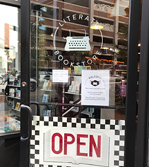
As a new transfer student to the University of Michigan, I had never been to Literati before. Before I began designing, I visited the store in person (undercover, of course) to finally experience it. Indeed, I was met with smiling faces, gracious employees, and pleasant vibes. Instantly, I understand what customers and the owner meant by the online experience not comparing to the store and brand itself. I took pictures of elements of the store I thought were memorable and special to the business.


Research Takeaway
Below are my key takeaways from all three research methods, that served as the objectives of this redesign.
-
Improved Genre Navigation and Direct Access
-
Enhance the visibility and accessibility of genres by making them selectable in a dropdown menu or on a separate directory page.
-
Provide links to genres and categories to allow customers to navigate directly to their desired sections, similar to the experience of browsing in the physical store.
-
-
Unreliable Information is an Added Stressor
-
Introduce a filtering system on the search results page to enhance usability and align with common design practices.
-
Allow users to select multiple filter options simultaneously to refine their search and further specify their preferences.
-
Improve the visibility and placement of sub-categories and category combinations on product pages, ensuring they are easily accessible for sorting purposes.
-
-
Create Moments of Delight In-person and Online
-
Literati is a local treasure that attracts people from all over the nation, and has even held the title of “Best Independent Bookstore in the Country." Every opportunity should be taken to make the online experience enjoyable as well.
-
Design Phase
Based on the research findings and observations, I proceeded to create a mid-fidelity wireframes utilizing a mobile-first approach. For this project, we were instructed to specifically redesign the process of buying a book beginning with landing on the site, selecting a book, and following through the purchasing process.
Card Sorting
To organize and brainstorm the informational architecture of the website, I used a card-sorting technique. I categorized webpages into sections based on the needs of customers of Literati, along with considering how other book e-commerce sites structure their sites. The navigation options were also consolidated into six categories (Books, Featured, Events & Requests, Merchandise & Giftcards, Blogs & Clubs, and About Us), to address the user issue of the excess number of drop-down options that had been acquired through the website’s expansion over the years, and promote better experience navigating through the site.

Mid-Fidelity Mobile Wireframes
An overview of the mobile wireframes I developed.

Mid-Fidelity Desktop Wireframes
An overview of the desktop wireframes I developed.

Key Features & Solutions
Adding Features that Reflect the In-Person Experience While Preserving Valuable Content
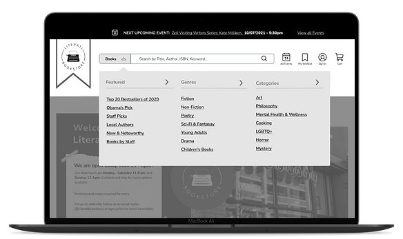
The redesign of Literati's website aimed to seamlessly incorporate elements of their physical store into the digital storefront. By integrating visual cues inspired by the store, such as tape-held notes for announcements, chalkboard sign-like bookshelves, and checkered floor-inspired website tiles, the goal was to create a unique and captivating bookstore experience online. Alongside this, the redesign ensured that important content, including events, store hours, and new and noteworthy books, remained visible and accessible. Prominent placement of the "Next Upcoming Event" in a contrasted banner and its inclusion in the navigation bar, along with a dedicated space for store hour announcements, guaranteed easy access to essential information. Additionally, popular book categories were prominently showcased after the announcements and the image of the outside storefront, replicating the enticing encounter customers have when visiting the physical store.

Giving a Face to the Literati Name
The greatest strength of the in-person experience has been missing—the Literati staff. Throughout the shopping experience, Literati staff avatars appear to provide book recommendations, offer assistance, and express gratitude when purchases are made, much like they would in-store. This further promotes the one-of-a-kind experience and customer connection, retailers like Amazon or Walmart, can’t offer.

Restructuring the Navigation Bar to Reflect User Expectations
When you walk into Literati Bookstore, you can easily read the genre and category chalkboard signs that are largely displayed above the top of the bookshelves, and walk right to the section you want to. With the current navigation bar layout, users aren’t clearly presented with this ability. Through competitive analysis of other e-commerce bookstore sites, I found that most sites offer a listing of genres/categories and subcategories upfront, either through drop-down menus or with an additional directory page. Currently, book topics or categories are “hidden” on the lower half of the page.


Chunking Content to Improve the Process of Buying a Book Online
Presenting users with vast amounts of information can cause users to perceive the website as overwhelming and give the impression that the website is difficult to use. Customers on Literati’s website expressed frustration with the checkout process, specifically with credit card information and shipping information.
Less Overwleming Product Pages
On the product pages, content sections such as reviews, product details, “About the Author”, and others, are placed into a vertical accordion to make the content of the page more understandable and make the process of purchasing a book less overwhelming. Information that may first impact a user’s decision to purchase a book (i.e. cost, rating, availability) is presented first, while other information remains undisplayed until the user wishes to view it.
Smoother Checkout Process
In my redesign, I break the checkout process down, page by page while consistently guiding the user through the process by showing what step they have just completed, and what step is about to take place next, and by allowing users to take a step and edit order details if they need to.

Personalizing the 404 Error Page
As another effort to incorporate the unique features of Literati’s store into the digital world, the “404 Error Page” was also considered as a part of the redesign. Inspired by the famous public typewriter, the new error page displays the Literati typewriter and offers the user an option to return to the previous page or to go back to the home page. Whereas before, users are presented with a text-only “PAGE NOT FOUND” display that does not provide a next course of action.


Future Iterations
While working on this project as part of a class assignment, the scope was limited to developing wireframes. Given more time, I would have seized the opportunity to conduct extensive user research, gaining valuable insights into their needs and identifying specific pain points directly from the customers themselves. Additionally, I would have delved deeper into exploring various color schemes and branding ideas to better capture the essence of the in-person experience and establish a stronger online presence for Literati. Expanding these areas would have allowed for a more comprehensive and refined design approach, aligning the website more closely with the vision and goals of Literati.
Final Thoughts
The experience of redesigning Literati's website has been invaluable in highlighting the significance of user interface design. It has underscored the profound impact that the placement and wording of buttons and content can have on the overall user experience. This project has also demonstrated how I can create a personalized experience by tailoring the design to meet the needs and preferences of individual users. It has deepened my understanding of the power of thoughtful and intentional design choices in crafting a website that truly resonates with its audience.